Ideas
Innisbrook’s online marketing consistency stands out.

BLANCHARD
A while back I wrote about how Sycuan had it right with the time they took with their email design.
Even more, however, is not just good design, but design that is often referred to as “on brand” or, much more simply defined, consistent with other marketing materials.
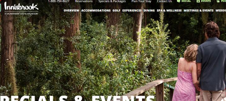
Innisbrook: Exhibit A
When you receive an email like this, there are certain design elements that help convey the message.

For example, notice:
- The logo size and placement
- The font used for the main headline
- The headline placement and size
- The dark blue/teal color
They are simple elements, but act as sort of a skeleton – a framework – for the design and content that is conveyed.
Innisbrook: Exhibit B
Now, with those elements in mind, look at what I see when I click on the main link in this email:
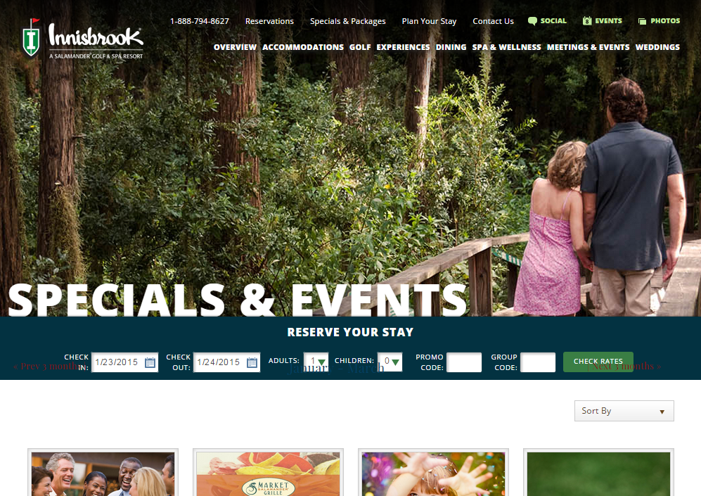
Is it exactly the same? No. But it doesn’t need to be because the skeleton…
- The logo size and placement
- The font used for the main headline
- The headline placement and size
- The dark blue/teal color
…is still there and helps tie these two steps of the customer’s journey together.
To Be Fair
To be fair, the flow was even greater when they originally sent this email almost a month and a half ago. But in a way, that illustrates a really important point about the structure I mentioned earlier.
If you are consistent with the way you use your brands colors, fonts, and logo, no matter which step someone starts at and takes along the way, every piece is seamlessly tied together.
Innisbrook (and the other Salamander Hotels/Resorts) have done an effective, yet simple, job at this.
- -
Thoughts? Feeback? I'd love to hear them. Just send me an email.
Get the weekly digest.
New stories and ideas delivered to your inbox every Friday morning.