Ideas
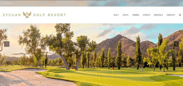
Creation, reach, and return; Sycuan’s balance is spot on.

BLANCHARD
When you think about an email open as a page view, suddenly the lack of design applied to email templates doesn’t make any sense at all.
Let’s say your golf resort does 20,000 unique on your website every month. If you have an open rate of 20%, it would take a monthly email volume of only 100,000 messages to make your email creative more visible than your website.
A Strong Example
Yes, I’ve written about Sycuan before and, unless their designer gets amnesial carpel tunnel, I probably will again because this is what I got in my inbox a couple weeks ago:

Study that for a minute.
Great typography, clean textures, clear messaging, concise copy…aside from possible readability issues on mobile, it’s a beautiful piece of marketing design (and, yes, it’s very readable and looks great on mobile too).
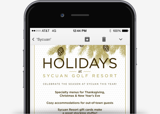
It really is lovely.
Remember the Scale
And, as I started out with, this is a piece of marketing worthy of the reach it will receive.
There are two ways to interpret that concept. You could either B) scale everything back to the lowest common denominator or, B), use this as a reminder that the attention given to a website because of it’s use/visibility means other channels (like email) may deserve the same attention.
I’d go with option “B” on this one.
- -
Thoughts? Feeback? I'd love to hear them. Just send me an email.
Get the weekly digest.
New stories and ideas delivered to your inbox every Friday morning.